Account management refresh
Reducing client support requests by redesigning the sign-in and account recovery experience
- Synthesized prior user research and support data
- Ran a top task heuristic evaluation to find high impact issues
- Prioritized opportunities by pain point & feasibility
- Led UX from problem definition through testing & handoff
- Self-built Claude agent for Accessibility check
Account access had become the largest source of learner frustration and support demand.
Client Contact Centre (CCC) data showed 81% of all support requests were account related. Users struggled to tell whether they should sign in, recover an account, create a new one, or recover after changing departments.
This confusion generated unnecessary support requests, duplicate accounts, and delayed access to learning.
Why it mattered
- Couldn't access mandatory training
- Uncertainty during onboarding
- Duplicated accounts
- High support volume
- Increased operational cost
- Poor first impression of the platform
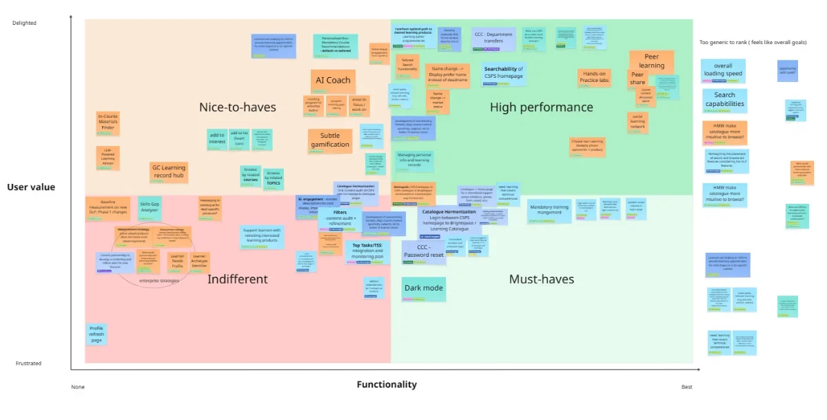
From identified potential features, I prioritized opportunities using the Kano model, weighing user value against functionality.
Account management emerged as the highest priority. It represented the largest volume of support cases while offering several low effort but high impact improvements.
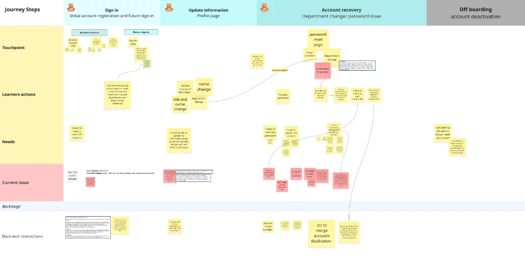
Journey mapping
I mapped four distinct account journeys to see where confusion originated.
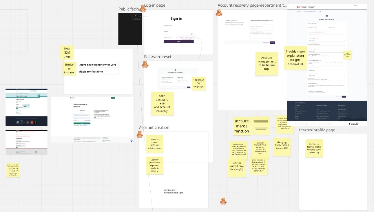
Observations & UX insights
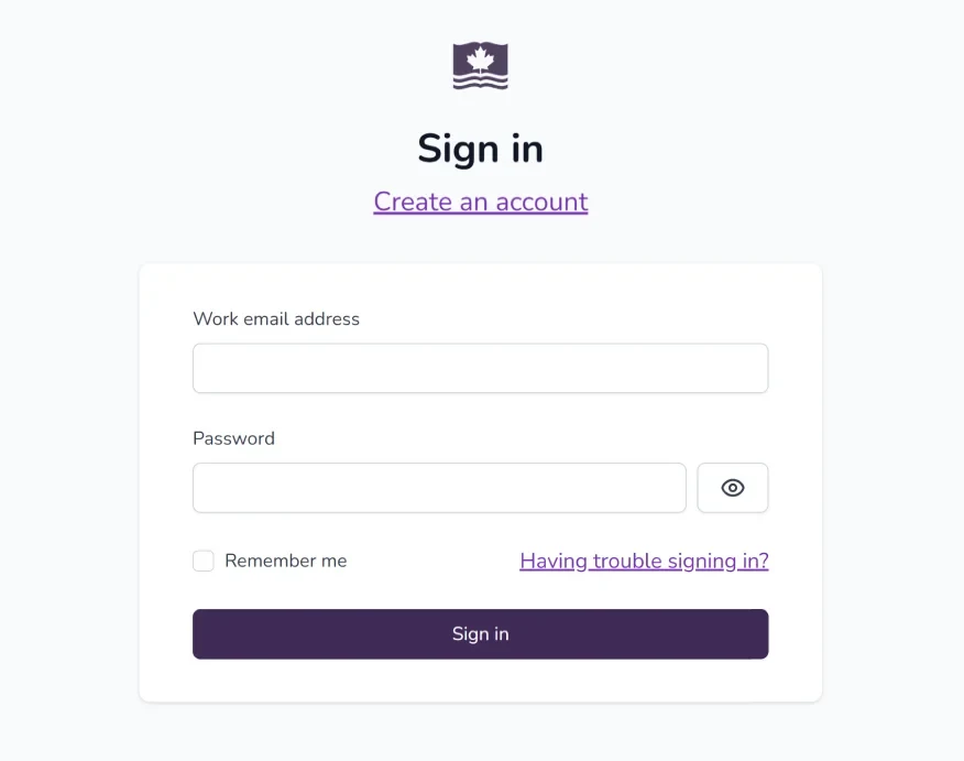
Help users identify the correct journey immediately
Reduce decision-making at sign in
Prevent duplicate accounts
Improve confidence through clear guidance
Minimize effort by reusing existing components
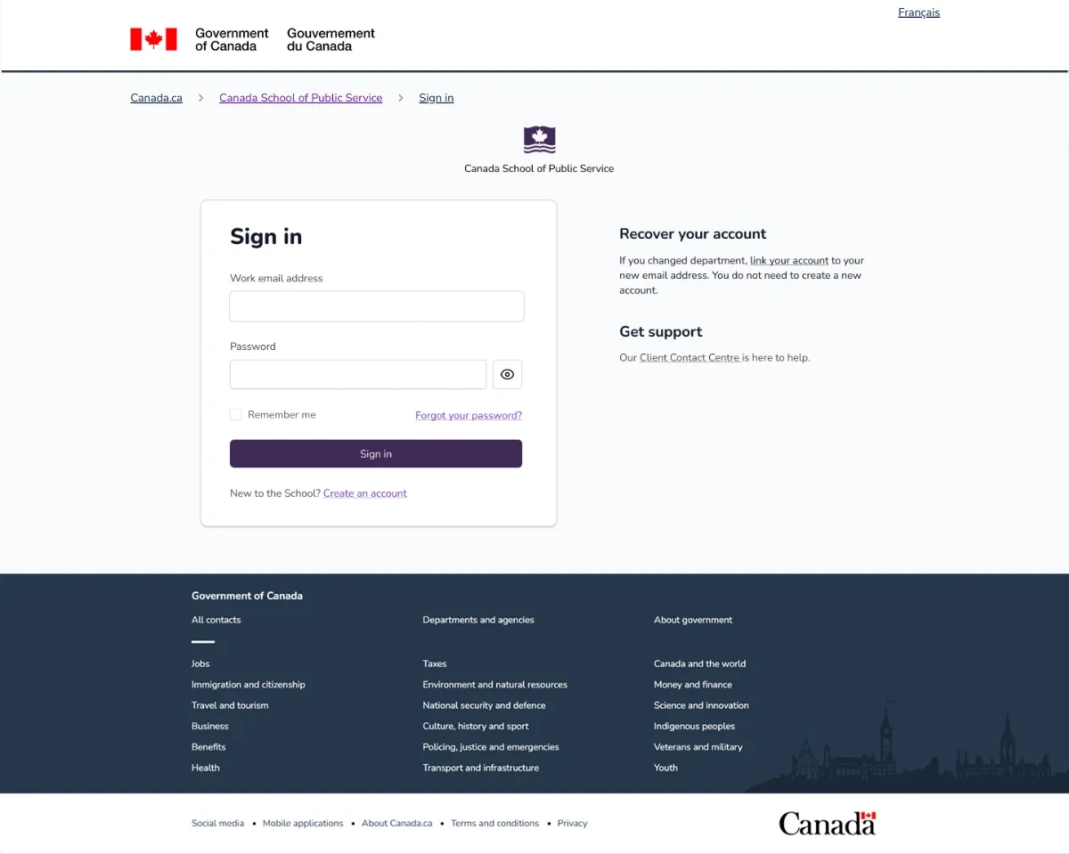
Make account paths immediately understandable
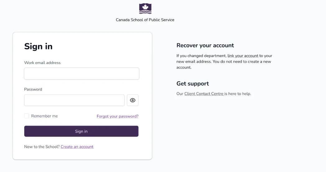
A two-column homepage clearly surfaced the primary action of signing in and secondary paths of account recovery and creation.
- Reduces cognitive load
- Establishes visual hierarchy
- Surfaces uncommon tasks without competing with sign in
- Decreases incorrect account creation
Clear guidance to increase confident at each step
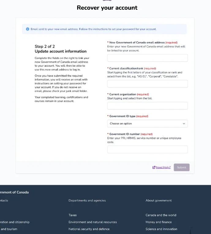
- Instructions using GC Design system stepper design
- Clear error and warning messages
- Progress indicator
- Plain language
Use existing design system components
Allowed engineering to implement quickly while maintaining consistency. I spoke with engineers to understand how the original page was built, then reused the same UI elements.
Surface secondary actions rather than hiding them
Rare actions should still be discoverable. Hiding recovery was the root cause of duplicate accounts and support calls.
Separate account creation from account recovery
Sorting user tasks right at the beginning will reduce confusion and decision making.
Trade-off — 2FA constraint
The 2FA also stood out as a pain point for frequent learners. But the measurement couldn't be changed due to privacy policy. I still raised the issue to the steering committee and proposed alternatives for future consideration.
Usability testing
Identified the correct journey
Noticed department transfer immediately
Recovered account with less hesitation
"I really like the the new use cases that you've added here.
— Usability test participant
They can click on this if they've changed department, which is also something that happens pretty frequently within the government, then they can follow this link to recover their accounts. That was a lot easier."
Accessibility testing
Ease of use across assistive technologies: screen reader, screen magnification & alternative navigation
80% recommendation rate
100% of testers completed the task
"I enjoyed that the interface was very simple. All the fields were very clear as well as the checkboxes. I also liked that the error messages were clear and easy to find with Voiceover."
— Fable accessibility test participant
- Faster account recovery
- Fewer duplicate accounts
- Greater confidence completing recovery
UX works in various scales within constrains. Continuing product improvement sometimes looks like small changes but lead to proven impact. Small wins are celebrated too!