Learning home: designing a personalized learning hub
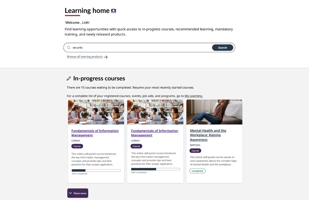
I designed the Learning home experience for the CSPS learning platform to help learners resume learning faster, track mandatory training clearly, and discover relevant products in one place. The new page shifted the experience from catalogue search and browse to curated and personalized learning.
Sole Product Designer
Product Manager · Engineering · AI Team · Accessibility Specialists
- Self-built Claude agent for Accessibility check
The CSPS learning platform lacked a dedicated personalized experience that helped learners quickly understand where they were in their journey, especially after a long gap between learning sessions.
Existing research showed learners had limited time to dedicate to learning beside their daily work. When entering the CSPS learning environment, they faced three core barriers.
Limited time for search and browse
Current search experience in the catalogue is under optimized
No tracking for mandatory training
No clear system for pending courses led to a high rate of incomplete learning.
Hard to discover
Large volumes of products and topics made finding courses difficult.
I led the redesign and delivery of the Learning Home experience for the CSPS learning platform. Building on an early homepage concept, I revisited research, synthesized learner insights, refined the information architecture, collaborated closely with engineering and accessibility specialists, and validated the experience through usability testing before implementation.
Research stats & insights
Client contact centre cases
Learners, users & accessibility testers
Research sessions
Internal ideation sessions
Usability sessions
Learners wanted to quickly resume learning
Limited time was the single biggest barrier to completion.
Mandatory training was hard to manage
The primary reason many public servants visited — yet completion status was unclear.
Learners wanted personalization
Many were motivated by professional and personal growth beyond compliance.
Business goals
- Encourage course completion
- Improve product discoverability
- Support organizational learning priorities
- Lay the foundation for personalized learning
UX goals
- Reduce browsing time
- Make it easy to resume pending courses
- Surface mandatory training progress clearly
- Help learners discover relevant new content
Drawing from research insights, the Learning home experience focused on four primary areas:
Four primary focus areas
Continue learning
Resume in-progress courses in one click.
Mandatory training
Track completion at a glance.
Recommended learning
Personalized picks, with feedback loops.
New learning
Surface the newest content to explore.
Integrated throughout the process
A11y feedback informed multiple iterations before development
- Fable accessibility testing
- WCAG-informed interaction design
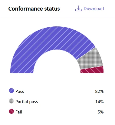
Leveraged the GC & CSPS Design systems
Developed new UI elements, includes:
- Learning cards
- Progress indicators
- Completion status pills
1. Quick resume to learning
Learners often left courses unfinished because they lacked time and had difficulty finding where they left off.
- Number and list of pending courses
- Progression bar with completion percentage
- One click resume learning
Design challenge:
Introduce new elements into existing product cards without changing the established catalogue design
How can I keeping the same card width and height, and minimizing engineering changes to the shared component?
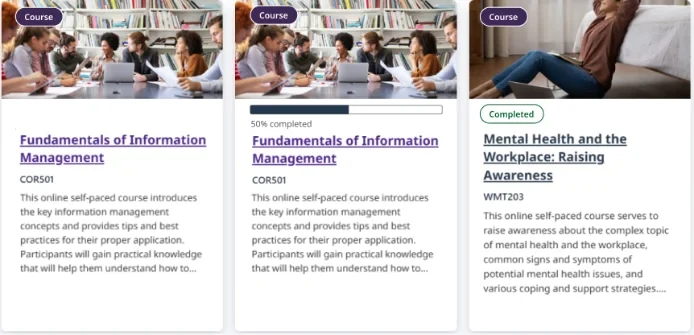
- Screen reader reading order
- Visual hierarchy mismatch
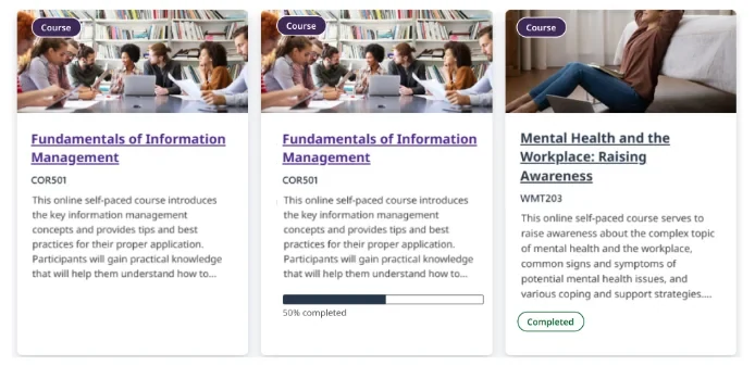
- Progress bar + completion pill aligned
- Issue with different description length creating gaps
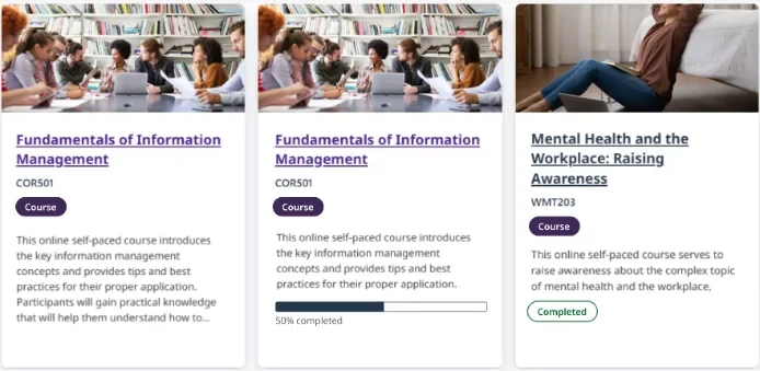
- Consistent with catalogue cards
- No awkward gaps
- Accessible reading order
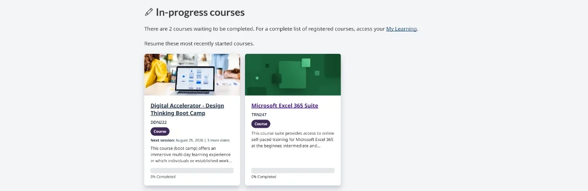
Through A/B testing with learners, refinement, and brainstorming with engineers, the final version preserved catalogue consistency, fixed inconsistent white space, maintained an accessible reading order, and minimized engineering changes to the shared component.
"I really like that it breaks out my in-progress courses so I can see what I haven't finished yet because I do have a tendency to be like, Oh, I have some time and start something and then totally forget about it. I love that"
— Usability test participant
2. Completion status for mandatory training
Mandatory learning was the primary learner goal, yet participants struggled to determine completion status.
Introduced a completion pill for quick status visual scan
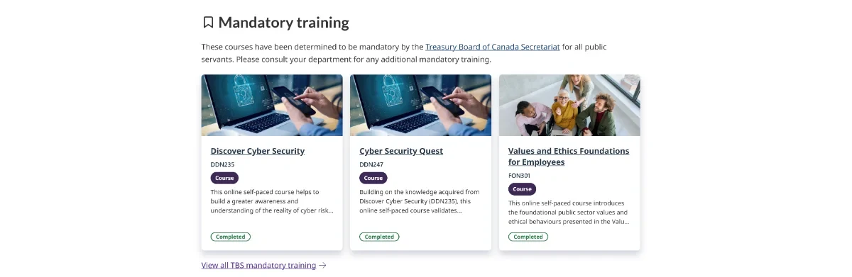
In testing, participants quickly identified outstanding mandatory training and understood their progress.
"I know that I already completed that one. This is actually a good example for me."
— Usability test participant
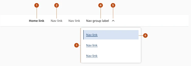
3. Consistent, scalable navigation
Separate breadcrumb and tab navigation created inconsistency and made wayfinding harder as the experience grew.
I replaced separate breadcrumb and tab navigation with a single navigation structure using the GC Design System to improve consistency, support wayfinding, and create a scalable solution validated through usability testing.
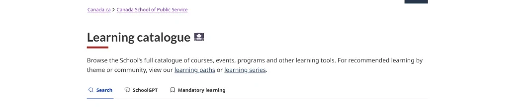
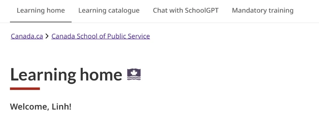
The new navigation brings all the current pages together for a harmonious Catalogue experience and complies with CG web requirements.
"I could go back to Learning Home there, Learning Home here, or just use the back button. Yeah, that's clear to me."
— Usability test participant
Learning home became the central destination for learners and a scalable framework for future personalization. It modernizes the platform to better meet learners' expectations, offering an experience comparable to established learning platforms in the markets.
Learner outcomes
Resume learning faster
Understand mandatory progress
Discover relevant learning
Explore new content
Receive personalized recommendations
This project demonstrated that personalization is more than recommending content. It requires understanding various learner goals, barriers, and supporting diverse learning behaviours.
As the sole designer, I had to budget time for user research, design iterations, working through technical constraints with and cross-functional teams and testing. This process gave me an opportunity to practice project management skill, adding another helpful tool to my tool box.